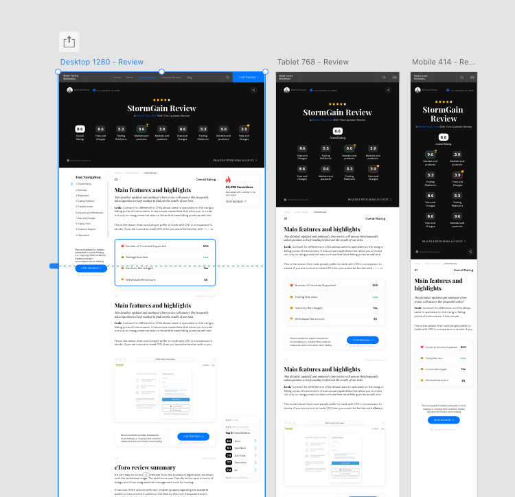
Hello All, I am a backend developer who works on a CMS system and recently I received an XD file from our designer, and it has 3 layouts - 1 per each device, like this -
Now I am trying to export all the 3 views with the following options -
‘scale to width’ + ‘scale on resize’ + ‘all artboards’ + ‘single page (show by size with media query)’
On the export what Im getting is basically 1 html page with ALL the views (inside a hidden divs, accordingly to the resolution), which is quite a bad practice in terms of resources and SEO… so I was wondering what would be the better approach to this.
The center options have been moved to the artboard Element Panel.
For your project is the content dynamic?
If dynamic, I would use the desktop artboard or a duplicate of the desktop artboard and then make that responsive following the responsive site videos:
It will go over things like making the hamburger menu and how to hide it unless you are on mobile. It will also go over making pop up menus. And IIRC it might go over changing the layout of a group of items.
If the content is static and not updated often I might export using media query option (what you now) depending if the size is negligible. You’ll have to check the export size.
From your description, it sounds like you will want to export using the responsive page options. The goal would be to export the desktop page and hide or update the layout as the page size shrinks down. The video will go over this and there are XD projects that go along with it.
You will have to update the export options if you follow the responsive export choice. Choose single artboard option in this case. You probably don’t want scaling.
This guide is not very clear to be honest… And I wonder why should I do so much extra work if the designer already defined the proper breakpoints and basically handled all the shows/hides on the XD side?.. Isn’t there a simple way where I can export 1 page only which will grab the proper elements based on the resolution?
It just sounds like a lot of extra work in order to properly export it. I wonder if it won’t be easier/faster doing it manually from scratch.
What parts of the guide aren’t clear? How far did you get? There’s step by step written instructions in the XD example project if the video is unclear.
The export option, single page with media query + all artboards, will automatically show the correct artboard based on the device size. Export using that option and then resize your browser. If this isn’t what you want you’ll need to add more description.
It sounds like you want a responsive site using a single artboard and then use the device sizes but if you don’t want to use to the export option I mentioned above then I recommend the responsive guide mentioned before. Doing it this way is more work at first (*see comment below). But this way is as close to the modern best practices of web designers in integrated tooling besides manually coding from scratch.
However, there is the other way. If you want to do it mostly manually use the advanced export option that will only export the markup only option with no default IDs. Then you can add classes manually in the element panel as if you were coding it yourself.
Having said that I might be missing your point. Is there something else you’re thinking of?
*Unless you are the main character in an anime you will have to do a bit of training: