if you can change flex-direction: column-reverse to flex-direction: column , the code is beautfull
Hi Bai-3,
Yes there’s a discrepancy in the layout with this feature. If you do all the layout settings yourself then the items are laid out in the default direction.
If you use the Stack layout option then the items are arranged reversed and then flex column reverse is used. This is because of the way a margin is added to each item to get the spacing to match.
If you are not using custom spacing I think you can use column instead of column reverse and it will work fine.
But if you have custom spacing between each item you may need to continue to use column reverse and rearrange the items in the Adobe XD layers panel. Does that make sense?
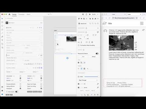
This is shown here at 1:25:
If it works for you either way let me know.
To summarize:
- if you change the default layout then the order of group items will probably be arranged the same in the page
- if you use Stack layout then the order may be reversed and you will probably need to go into the layer panel and reorder them
