it would be really useful if hover styles could be applied to all instances of a component.
Suggestion:
so if i have a component named componentName, all instances of this component would by default have the css class .componentName applied.
then it would be quite easy to add a custom style:
.componentName:hover{
background: grey; or fill:grey;
}
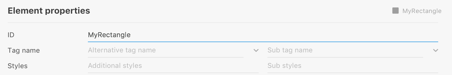
edit: this can be done manually by adding a class to the element options / additional classes (to each instance of the component)
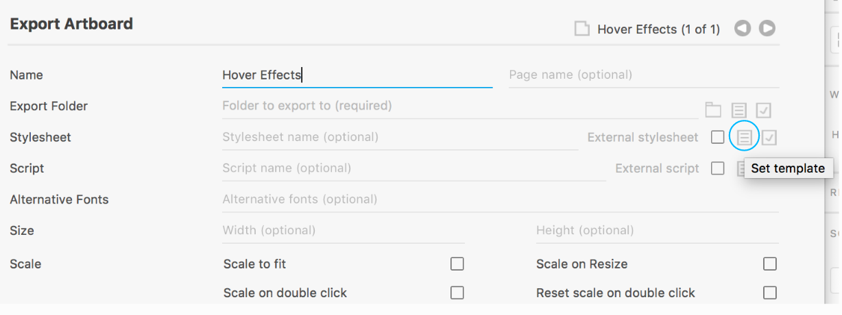
and then adding to the stylesheet template like so:
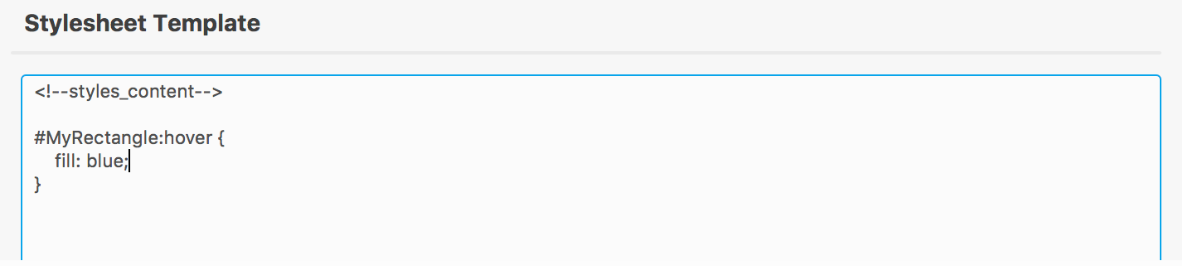
<!--styles_content-->
.hoverTest{
cursor:pointer;
}
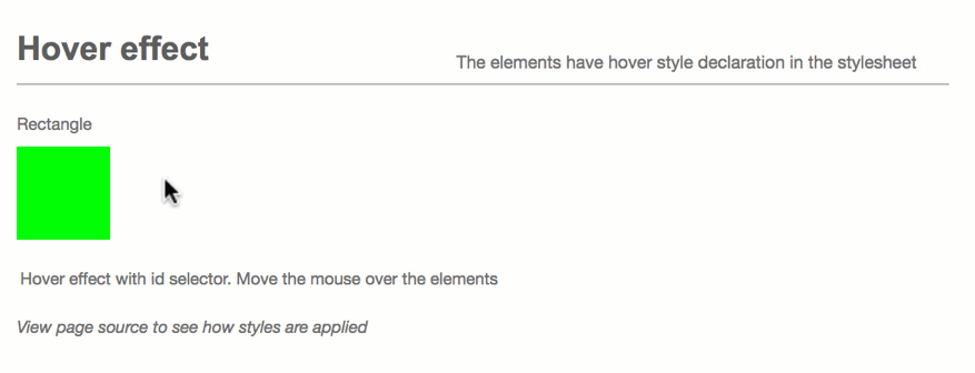
.hoverTest:hover rect{
fill:grey !important;
}
note: the !important is needed, because the default style is applied via id, which has a higher priority than a style applied via class.
the rect selector has to be added, because while the ID is given to the rect itself, the additional class is given to the containing svg element.
if you want to adress specific items inside the component, you will have to give them additional classes too and address them this way:
.btnHover:hover .inset rect{
	fill: grey !important;
}
it is neat that the element options are inherited by instances though!
it would be useful to have these shared classes as default for instances components. this would also allow to clean up duplicate styles, which currently are created due to them being applied via individual ids:
#Rechteck_370 {
	fill: rgba(27,146,199,1);
}
#Rechteck_370_A0_Rectangle_8 {
	fill: rgba(27,146,199,1);
}
#Rechteck_370_A0_Rectangle_10 {
	fill: rgba(27,146,199,1);
}
could be reduced to
.Rechteck_370 {
	fill: rgba(27,146,199,1);
}